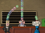
Postmortem: Slimy Pete’s Singles Bar; Or What I Learned From Making A Bad Game With Pretty Graphics
Wednesday, October 18th, 2006Few weeks back I released a done-in-7-days-game by the name of Slimy Pete’s Singles Bar. The download link for the game is here. The game mechanism is actually rather crappy, but playing it might help understand what I rant here about. (For the record, before releasing the game here I knew it was a bad egg, but I didn’t want to over shadow the game by announcing my opinions).
Things that went horribly Wrong or Lessons I learned
 1. Good Graphics Don’t Save a Bad Game
I know that your thinking that I’m a complete idiot, for having to make a game to realize this, when playing any Myst game would have told me this in a second. But when your in love with your own ideas, you don’t think straight. It toke me two hours to set up a very crude prototype of the core mechanisms (with recycled graphics from Marbles). I remember thinking that this isn’t all that fun, but that’s probably because the graphics suck. So created a bit better placeholder art. The game still sucked so I created even better art for it.
I should have realized that glittering graphics don’t magically turn my game into something playable. When I was developing Jimmy’s Lost His Marbles, I had a lot of fun playing around with the ugliest early prototype ever (with broken ui). From now on I’ll have to create the early prototypes with the ugliest graphics ever. Not wasting my devtime in the beginning creating the graphics, but I’ll spend it making the blue square prototype fun to play. As Raph Koster said in his great blog post 40 ways to be a better (game) designer:
Art enhances, multiplies, improves. It does not replace missing fun. If you can get to something fun with minimal presentation, it will get more fun with good presentation.
2. Player Has Too Little Control
The reason why the game isn’t fun to play, is that the player has way too little control over the events. In Slimy Pete’s there is no way to think ahead or make meaningful decisions. More experienced game designer could have known this even before making the prototype. I didn’t and I didn’t even realize it when I playtested the blue square prototype.
I know that seems like a very trivial thing, but I never figured this out before. Control is essential for a good game. Nothing is more irritating than playing an action game where the character doesn’t seem to respond to your controls. Or think of playing strategy game where the A.I. is actually running the show and you have no control. I busted my head trying to come up with a good game that gives the player very little control. I couldn’t figure out any. Games tend to give players more control than is logically possible. For example in Civilization the player has almost god like control over his nation. In almost any action game the player runs faster, jump higher, endures more damage than is realistically possible for a human. And there’s a good reason for all this. Control == (more) fun, artificial restrictions != (less) fun. Nobody likes when developers limit the number of saves, put in invisible walls or disable the ability to undress your female fighters.
3. Couldn’t bring myself to shoot the baby in the crib
As I said before, I fell in love with my own idea. I didn’t want to believe that the game was crappy, so I just kept on working on the graphics. Instead I should have just murdered the game brutally. No point in trying to salvage a broken idea. But killing your pet game idea turned out to be rather hard thing to do.
 Before I started creating prototypes of my game ideas, I thought there is no point in prototyping because the games where already perfect. I had them figured in my head. Now I have learned that you cannot design a game in your head or even on paper. Because there is no guarantee that the game will be fun. You just have to test it with an open mind, with the mentality of molding it into something better. If the game sucks you have to be able to pull the trigger, kill the game, bury it deep and wait until lightning strikes and brings it back to life. Like Jason in Friday 13th. It’s possible that the day may never come when you figure out how to make the game fun to play. But at least now you are wiser. Knowledge hurts and that’s why I don’t want to prototype every game idea I have. I have build up the feeling in my head, of how much fun it would be to play the game. And I kinda want to presume that. I don’t want to kill them by testing with ugly graphics, because that’s not the way I see it in my head.
Sometimes it hurts when you have to bury your favorite child and you want to remember the game just the way it was in your head. Sometimes it’s a relief to know that the game will never turn out to be anything great. Don’t have to waste time dreaming of them.
What Went Right
1. Pretty Graphics
I’m kind of a proud about the graphics. I know the gameplay sucks, but I also know that the pretty outer shell can fool a lot executive kinda guys. Or to put it this way, it looks nice on my CV and I know that nobody who’s going to interview me for a job is going play it enough to realize the gameplay sucks.
2. I Made A Game That Sucks
Why is this a good thing? Well first of all I’m not one of those optimists that turn everything into a happy sunshining experience, I’m more of those cynical bastard kinda, but never the less I’m happy that I made a bad game. It’s liberating. When you try to create something new your bound to fail, embracing the possibility of failure will probably let me do even wilder (and possibly crappier) games. I’m no longer afraid to screw up, I know that I have done it already.
3. It’s Juicy
Compared to Marbles, Slimy Pete’s has a lot more juiciness. There is nice feedback for the player, in form a sound effects and graphics and it has a good feeling all around. To put it this the outer shell is much better than in Marbles but Marbles has that inner beauty that really matters.
Conclusion
In the post, the game comes out as more worst than it really is. It’s playable, but not enjoyable. But I’m happy that I made the game. I learned a lot from this one. Had a first hand experience of the things Experimental Gameplay Project guys wrote about. I would even recommend doing a bad game as a learning experience. (Or atleast, you can do as I did and dub your bad games as learning experiences).
 Few weeks back I released this